- Trading
- Trading
- Markets
- Markets
- Platforms
- Platforms
- Platforms
- Platforms
- Education
- Education
- Education
- Education
- Help & support
- Help & support
- About
- Trading
- Trading
- Markets
- Markets
- Platforms
- Platforms
- Platforms
- Platforms
- Education
- Education
- Education
- Education
- Help & support
- Help & support
- About
 News & Analysis
Yield Curves: What Are They And How Can We Use Them?
19 October 2018
Undoubtedly anybody who dabbles or takes an interest in the financial markets will have come across the term yield curves. Perhaps stumbled on during research or overhearing Bloomberg TV hammer home various aspects of yield curve movements. Either way, yield curves are embedded in the fabric of financial analysis and are considered a fundamental component of the trading world. Whether you’ve heard of them or not, we will break-down some of the crucial factors and how we might incorporate these into our trading plans.
What are Yield Curves?
Yield curves are a graphical representation of the yields between different maturities of a sovereign debt bond.
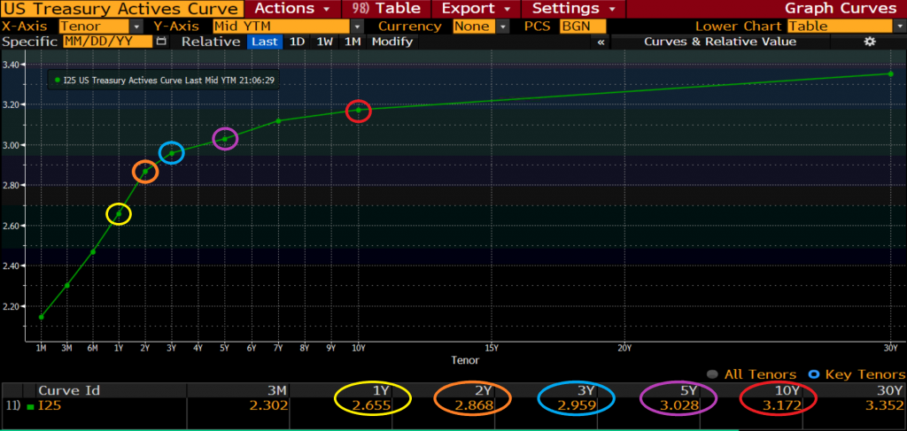
U.S. Sovereign Bond Yield Curve
Bond yields are the amount of return an investor will make for the purchase of a particular bond. Given that yields are the return derived from a specific product, this provides us with additional assets to look at, in-turn increasing the amount of market information. For simplicity sake, this article will focus on the U.S. 10-year bond yield.
What is a Sovereign Bond?
The national government issues sovereign bonds, and there could be many reasons for this process. Most commonly, they are issued to cover a shortfall in budgets or as part of a central banks monetary policy to help support or sustain the economy. As such, most investors view government bonds as almost risk-free products. It is this aspect that we will be focusing on here.As these government bonds are seen mainly as risk-free products when markets become a little more tumultuous, investors tend to remove money from slightly riskier products/assets and place them into products with less risk. This activity is more commonly known as “risk-off” or “flight to quality.”
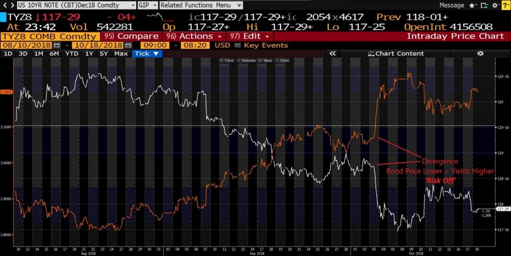
U.S. 10yr T-Note & 10yr Yield Overlay
This knowledge helps us better understand market sentiment and can aid us in timing the market when we’re about to enter or exit positions.
Yields are inversely correlated to bond prices, meaning that the higher the actual bond price trades, the lower the yield and vice versa. You’ll find an example of this in the chart above, looking at the U.S. 10yr T-Note Bond (white line) and the U.S. 10yr Yield (orange line).
As the bond price trades drastically lower on October 3rd, we also see the yield price jump in unison. The reason for this is because as demand for the bond’s increase, investors pay a higher price but the lower the yield the government has to offer as a return.
Alternatively, the lower the demand, the lower the price for that particular bond and as such, the yield drifts higher to attract more investors to the product. Ultimately, this helps support the economic policy the central bank has in place.
While this is excellent information to know, what we are interested in is how does this help us with our day-to-day trading. As discussed earlier, when bond prices push higher, this is when the market has taken a ‘risk-off’ mindset. Therefore when bonds push lower, and yields go higher, this is when the market has turned ‘risk-on’ and investors are willing to move away from markets deemed relatively safe to slightly more riskier markets seeking higher returns. When this happens, historically what we see is a rally in Equity markets, which is what we can see from the chart below.
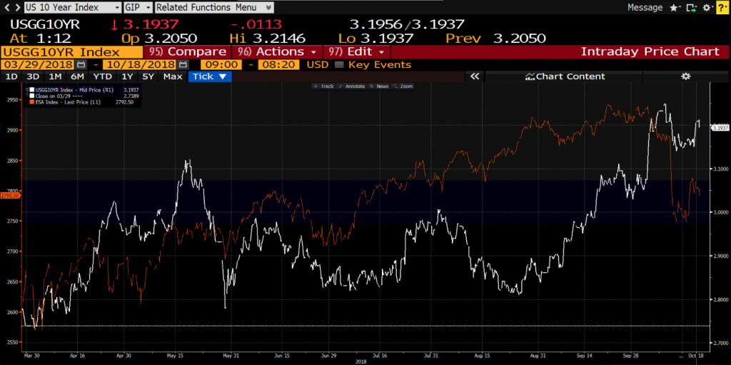
U.S. 10Yr Yield & S&P Futures contract Overlay
In this chart, we can see the U.S. 10-year yield (white line) overlayed with the S&P 500 active futures contract (orange line) and the correlation between the two. At points where the U.S. 10-year yield rallies we also see a rally in the S&P, although it’s worth noting that the S&P will ordinarily see more aggressive moves because of the sheer quantity of trades that take place on the S&P.
So what we see here is the ‘risk-on’ mindset playing out in the markets. It can also be applied to the other major economies, for example, looking at the yield for the UK 10yr Bond overlayed with the FTSE will garner a similar result.
In summary, what can we look at to trade knowing this correlation with bonds & yields to market sentiment? The most obvious place to start would be equity indices such as the S&P500, the FTSE100, Nasdaq, Nikkei 225, etc. These are all good options given their tight correlation to the bond market movements. Aside from that, you could also consider gold. Given the precious metal has traditional safe-haven status, it’s a pretty good asset to gauge concerning risk-on/risk-off sentiment.
For more information or any questions feel free to reach out to me on twitter – @Alex_GoMarkets
This article is written by a GO Markets Analyst and is based on their independent analysis. They remain fully responsible for the views expressed as well as any remaining error or omissions. Trading Forex and Derivatives carries a high level of risk.
Sources: BloombergThe information provided is of general nature only and does not take into account your personal objectives, financial situations or needs. Before acting on any information provided, you should consider whether the information is suitable for you and your personal circumstances and if necessary, seek appropriate professional advice. All opinions, conclusions, forecasts or recommendations are reasonably held at the time of compilation but are subject to change without notice. Past performance is not an indication of future performance. Go Markets Pty Ltd, ABN 85 081 864 039, AFSL 254963 is a CFD issuer, and trading carries significant risks and is not suitable for everyone. You do not own or have any interest in the rights to the underlying assets. You should consider the appropriateness by reviewing our TMD, FSG, PDS and other CFD legal documents to ensure you understand the risks before you invest in CFDs. These documents are available here.
#ForexStrategy #ForexTrading #ForexTraining #ForexCourse #ForexEducation #ForexHelp #ForexAnalysis #FXSignal #MetaTrader #MetaTrader4 #MetaTrader5Next Article
Up Next: The Bank of Canada Rate Decision
One of the must-watch economic events this week will be the Bank of Canada interest rate decision. The decision is scheduled to be announced on Wednesday at 14:00 PM London time. It will be the first meeting since the new United States–Mexico–Canada Agreement (USMCA). The bank has increased its interest rates four times since July of last year,...
October 22, 2018Read More >Previous Article
Top 5 Silver Exporters In The World
In the last article, I wrote about the top 5 gold exporters in the world. Now it is time to look at the top 5 exporters of another one of worl...
October 17, 2018Read More >
- Trading
- Trading
- Trading
- Markets
- Markets
- Products overview
- Forex
- Commodities
- Metals
- Indices
- Shares
- Cryptocurrencies
- Treasuries
- Platforms
- Platforms
- Platforms
- Platforms
- Platforms overview
- MetaTrader 4
- MetaTrader 5
- Education
- Education
- Education
- Education
- News & analysis
- Education Hub
- Economic calendar
- Help & support
- Help & support
- About